Problem Statement
The M6 Mobile Hotspot requires a UX update on its dashboard to accommodate new features across both the device display and the web portal
As the product is new to its lineup, the main problem is identified as integrating the addition of a few features into the previous UX framework
I also took the initiative to formulate the main UX for the primary new feature, Power Manager, as part of the feature accommodation process
Main Features
Consistent usability throughout multiple touchpoints
This section offers a sneak peek of some highlighted features covered during my work on the M6 Mobile Hotspot project
Web Portal
M6‘s primary new feature Power Manager optimizes hotspot's battery consumption and performance, while its larger web portal offers convenient shortcuts on the homepage
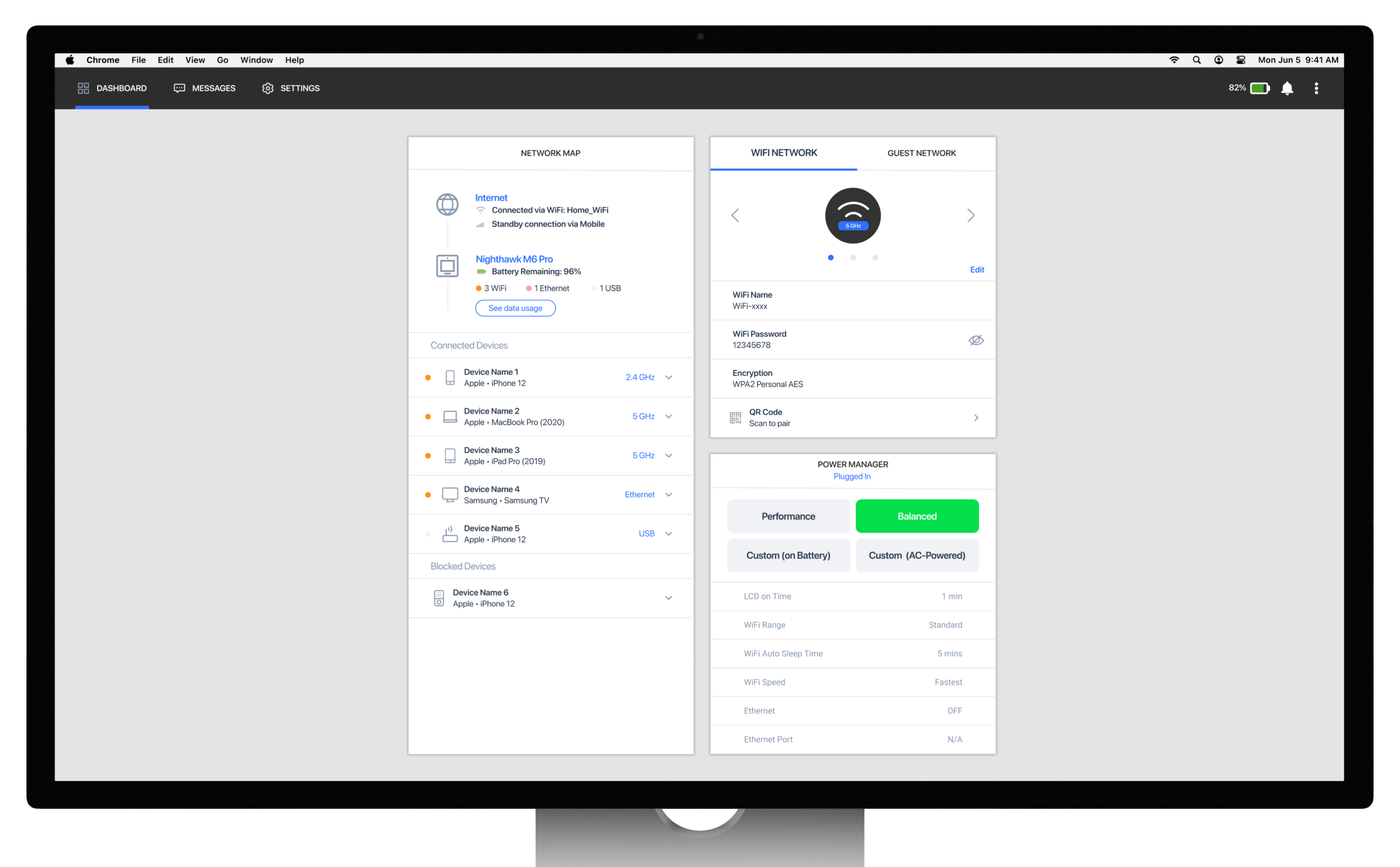
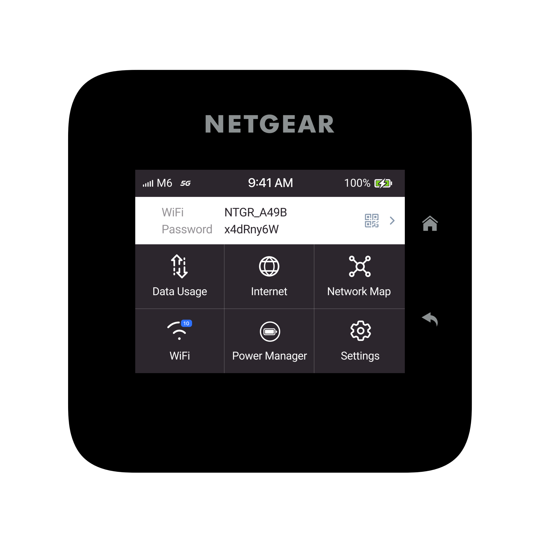
Device Display
As users frequently interact with the hardware device, having an easily accessible entry point for the Power Manager is crucial to enhance their experience with the feature
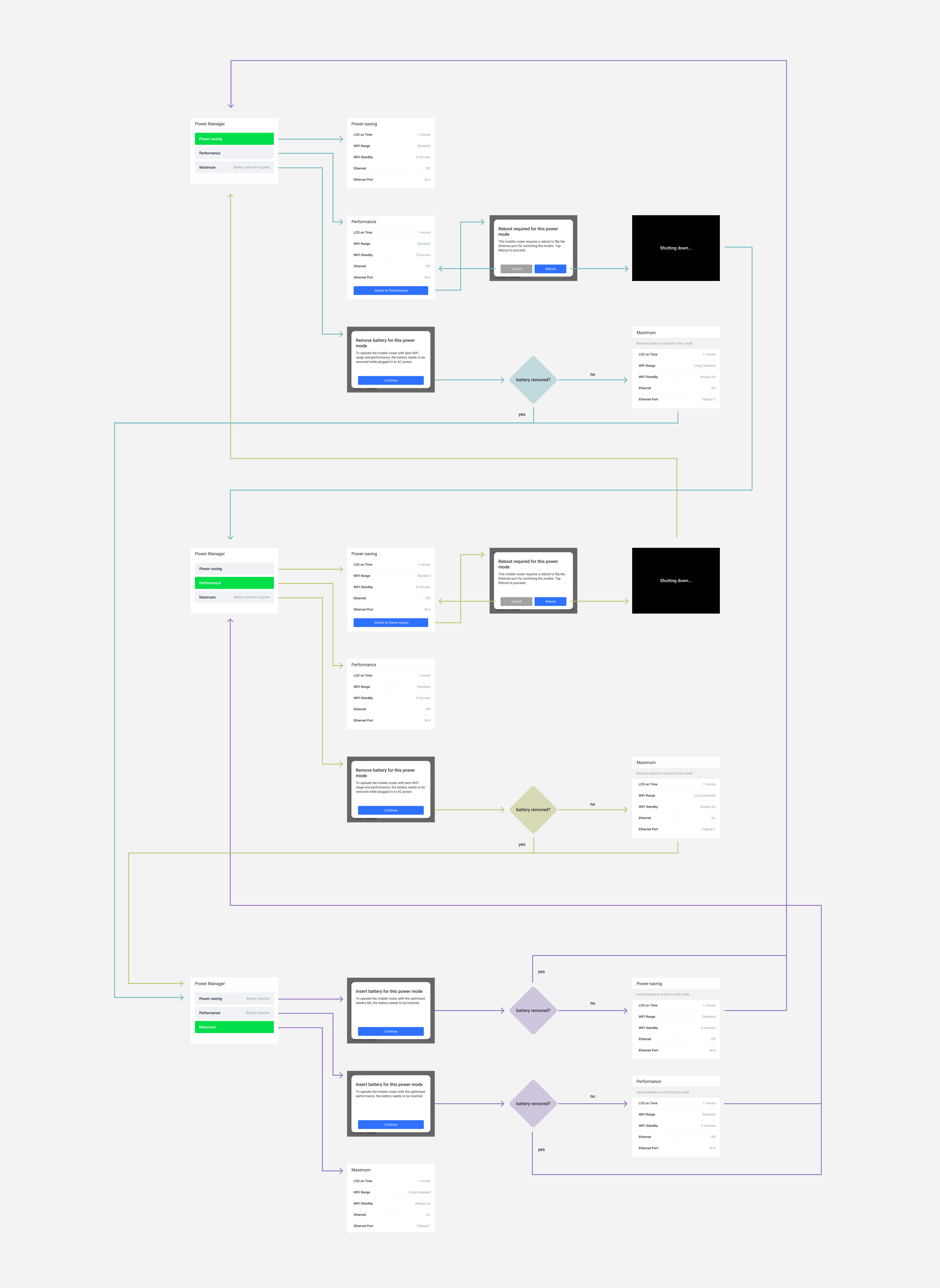
Power Manager UX
I focused on creating a seamless experience for users by incorporating all possible flows between different modes into a cohesive user experience that is easy to follow and understand, recognizing technical constraints and resolving with active communication with the cross-functional teams
Testimonials
Genuine customer reviews are the best motivation
See how customers and tech reviewers experience M6 and the Power Manager feature below (main feature from 01:31)
Takeaways
Do like a designer, think like a user
Designing for a new feature can induce anxiety due to uncertainty about its appearance
Shifting perspective to that of the user allows for evaluation of whether the feature would be appreciated
This approach fostered confidence in the design process
If you think you don't understand something, ask somebody