Problem Statement
The current loading experience lacks clarity in effectively communicating the connection status and providing effective troubleshooting guidance for 2.2 million regular Netgear app users.
As an essential feature for router-connecting apps, the impact of this feature addresses all users of the NETGEAR apps, including Orbi and Nighthawk.
Through communication with design researchers, I identified the main behaviors of users of the targeted apps, contributing to the insights outlined below.
Pain Points
Through a further dive into understanding the target users, I identified their main pain points, which helped summarize key attributes that can directly benefit design decisions as references.
1
Hindered by a torturous, long wait time
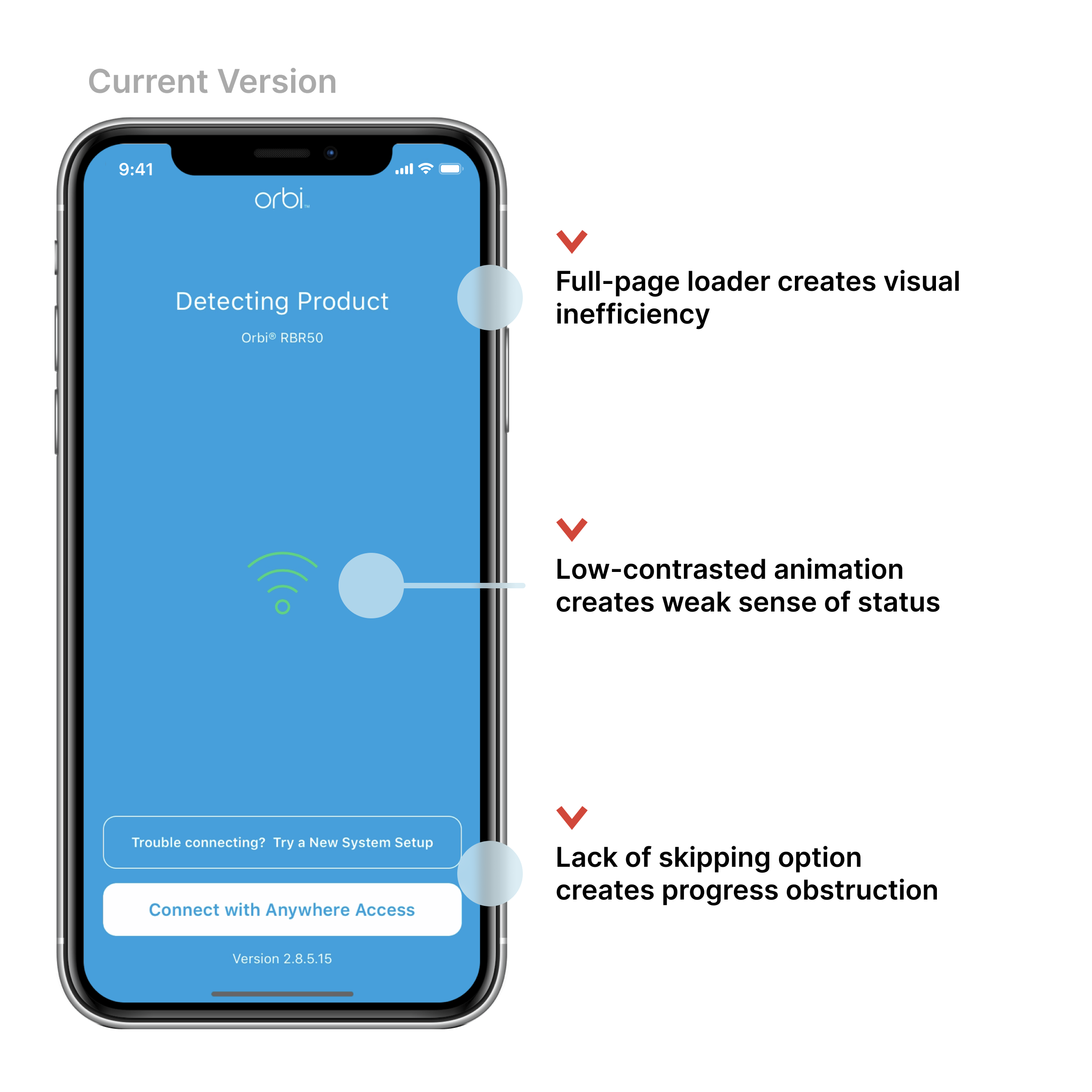
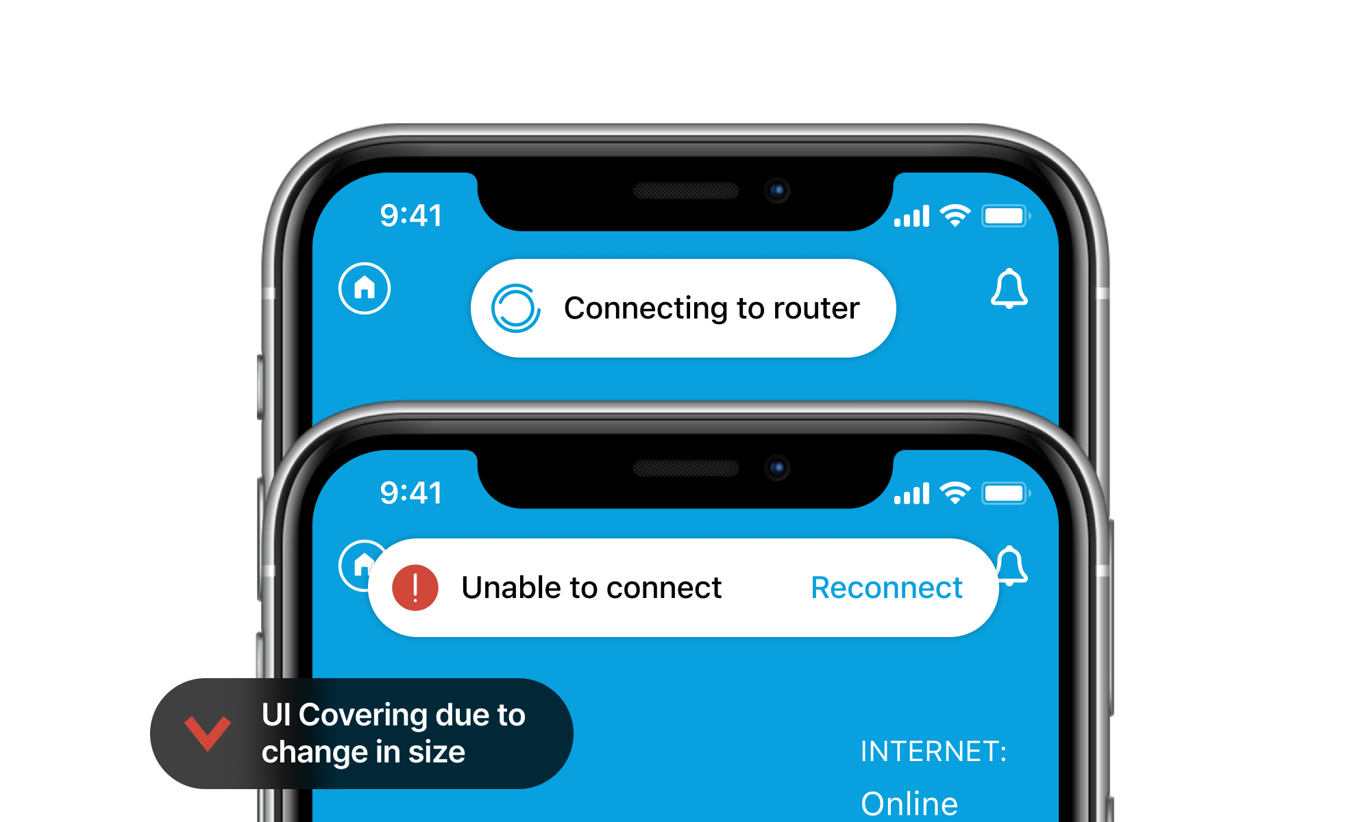
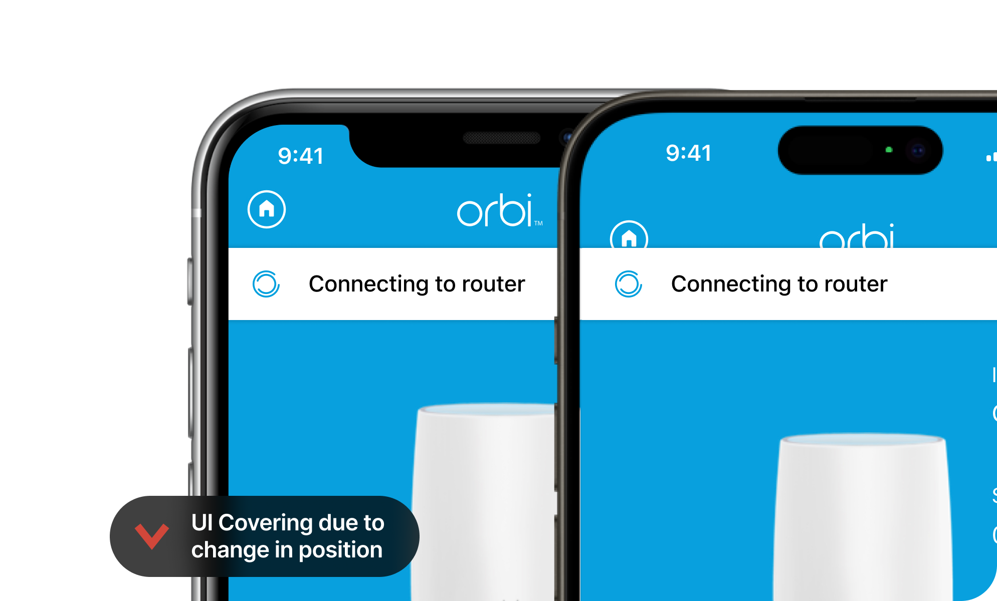
With the loading taking up to 30 seconds, it's displeasing for users to stare at the prominent loader and wait.
2
Not able to access features that do not require network access
Many users open the apps to access services such as Armor Security and Smart Parental Control, and the current loader prevents users from accessing them promptly.
3
Feeling frustrated with an obstructive troubleshooting experience
When the connection fails, the current experience prevents users from navigating to the app's home screen, creating a "dead-end" user experience.
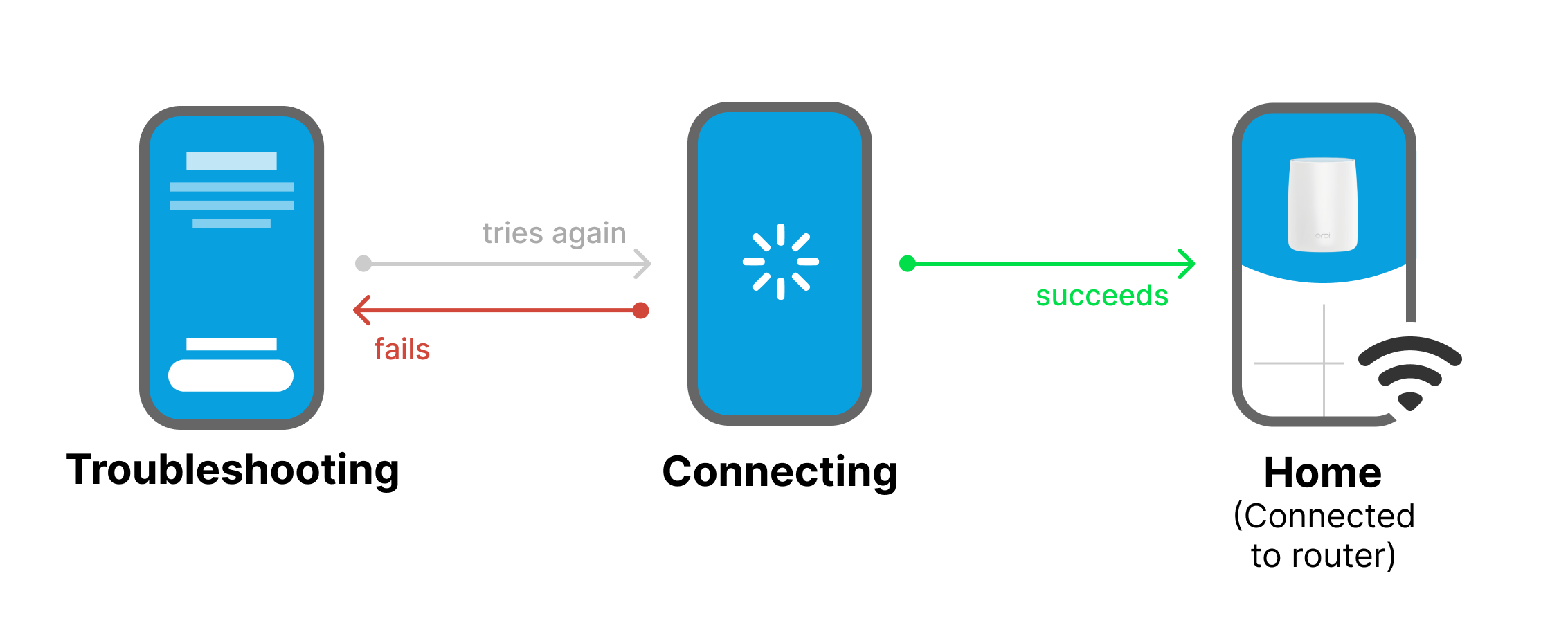
Current UX Analysis
Paying attention to both the happy path and the error state matters.
Before any design works, I invested in going through the app's loading experience and trying all different cases with various of network conditions.
Through auditing the current experience, I identified significant design opportunities for both Orbi and Nighthawk users, addressing key pain points in both "happy path" and "error state" scenarios.
Design Opportunities
Happy path: Clarity
Bringing more clarity to users through the loader enables them to feel more confident using the app, benefiting their desires for efficiency and greater accessibility to the services they need.
Error state: Guidance
More tailored and well-communicated troubleshooting instructions and guidance benefit users with a moderate level of knowledge in network settings to resolve their problems.
Happy Path
How might we increase the clarity of the loading experience so users can quickly understand the connection status and the features enabled to access while waiting?
Based on the analysis of user attributes, I identified that the happy-path UX improvement would mostly benefit users who struggle with the following pain points.
Pain Points
1
Hindered by a torturous, long wait time
2
Not able to access features that do not require network access
These goals reflect users' need in a loading experience that is prompt, accessible, and informative, enabling further design analysis and iterations.
User Goals
1
Access to home and other features as early as possible
2
Be clearly informed of the change of connection status
Feature-goal Alignment
Building on the insights summarized from the previous section, I assessed several key attributes of the current loading experience feature to determine its alignment with user goals and needs.
Connecting-state Iterations
Recognizing the misalignment between the current features and the user goals and needs, I conducted several rounds of iterations, annotating key attributes on the side to compare with the previous version (toggle for iterations):
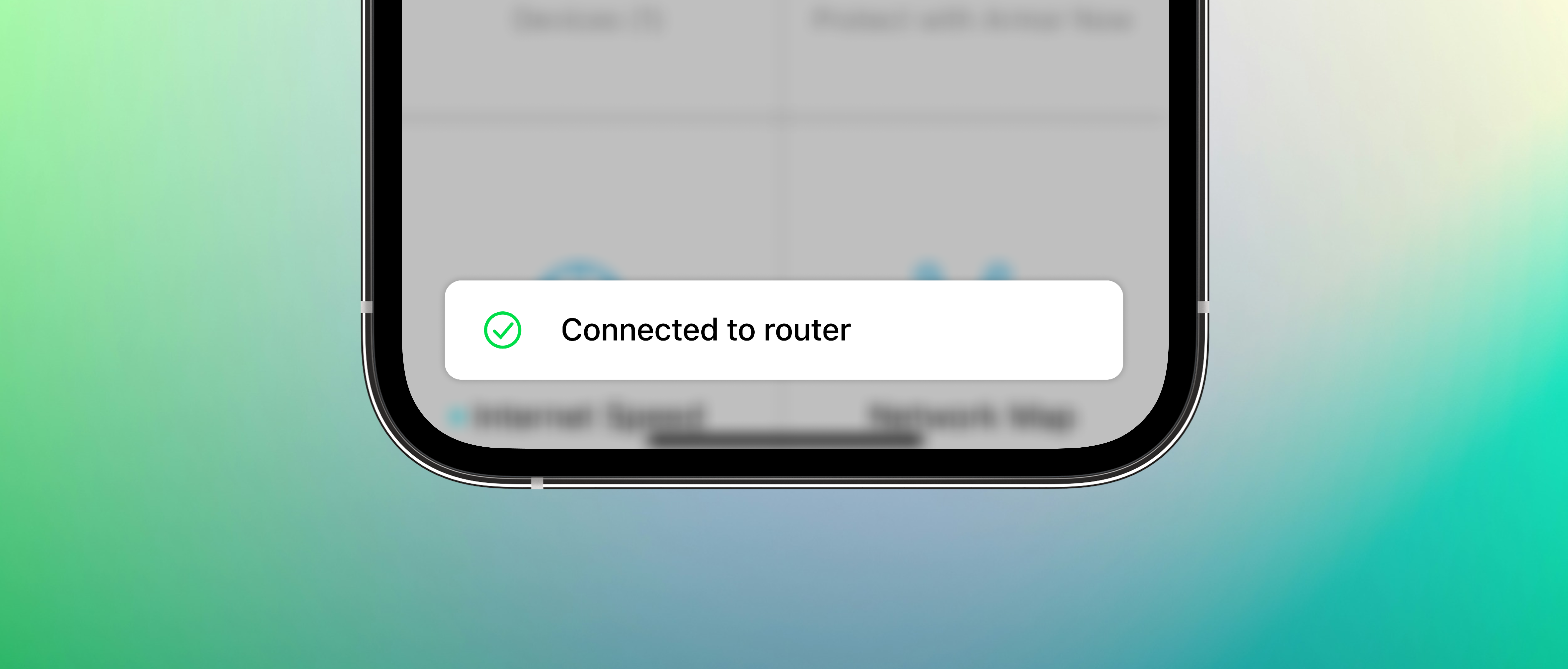
A complete Happy-path Experience
While the prior explorations focused on the connecting state, the happy path wouldn't be complete with the connected state
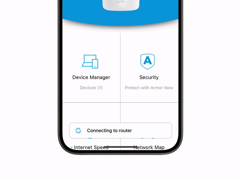
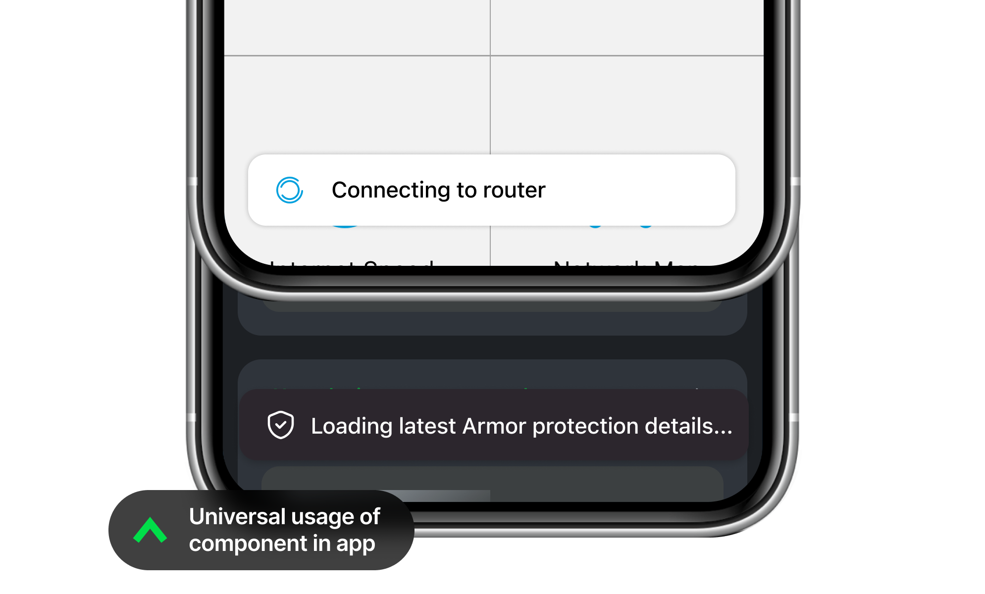
The toast banner design for the loader incorporates subtle animation to provide users with essential information about changes in states without obstructing the home page, where other features can be accessed
Error State
How might we provide better guidance for troubleshooting so users feel fewer frustrated with less dead-ends?
As the current error state experience only communicates generic copies for troubleshooting, it's not only a confusing but frustrating experience, if problems persist after users fail to resolve with the poor guidance.
Pain Point
3
Feeling frustrated with an obstructive troubleshooting experience
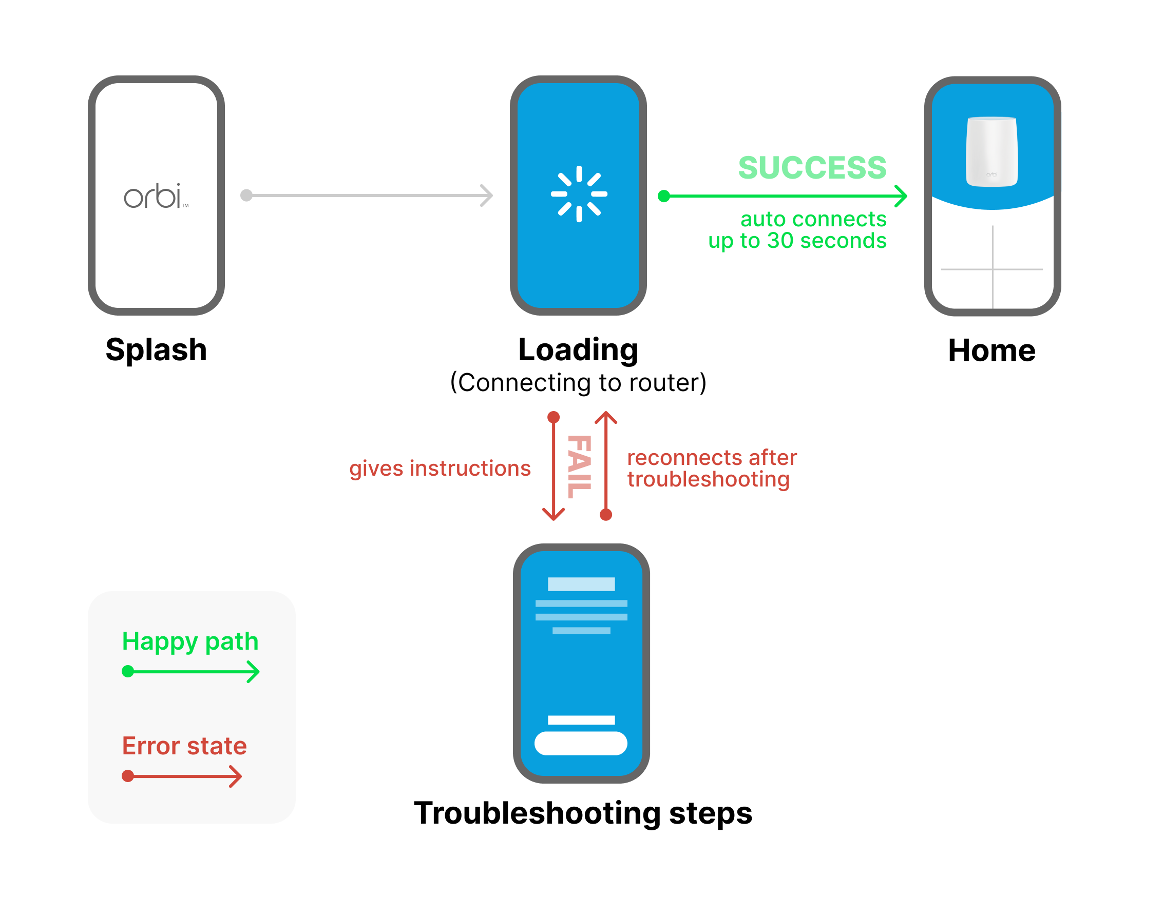
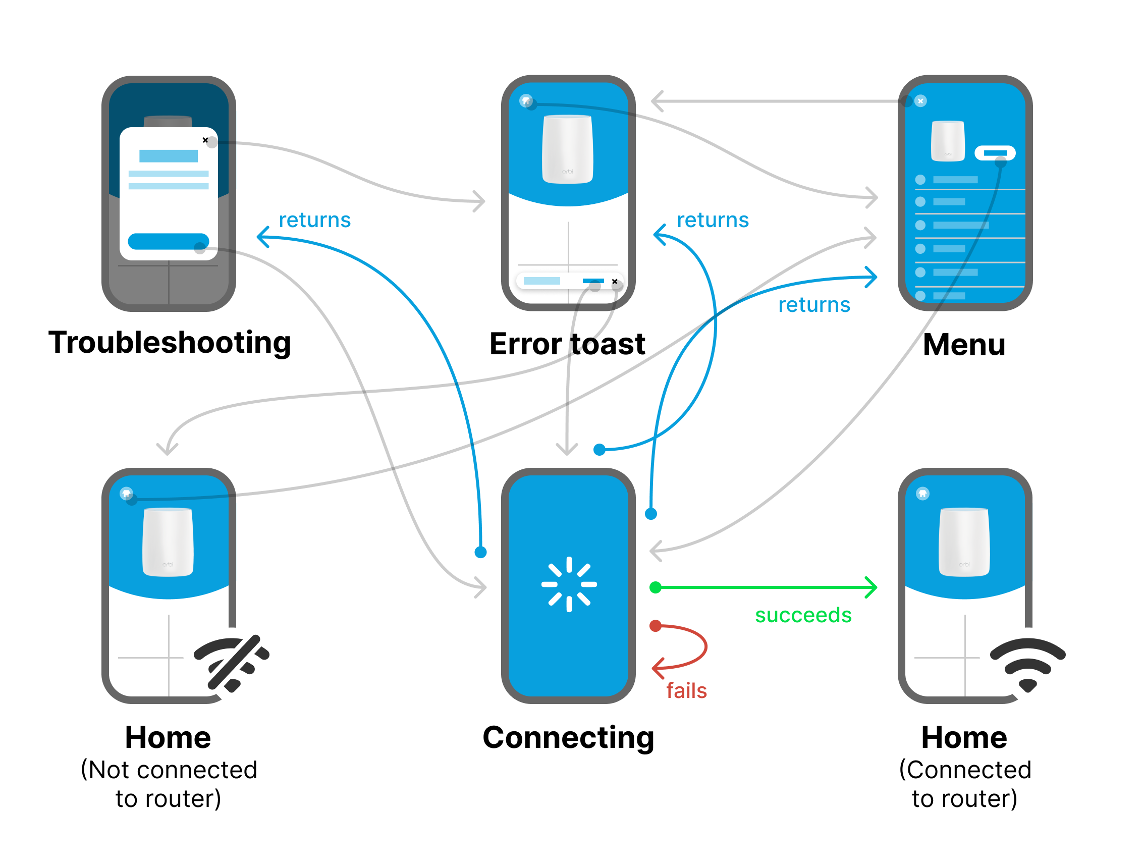
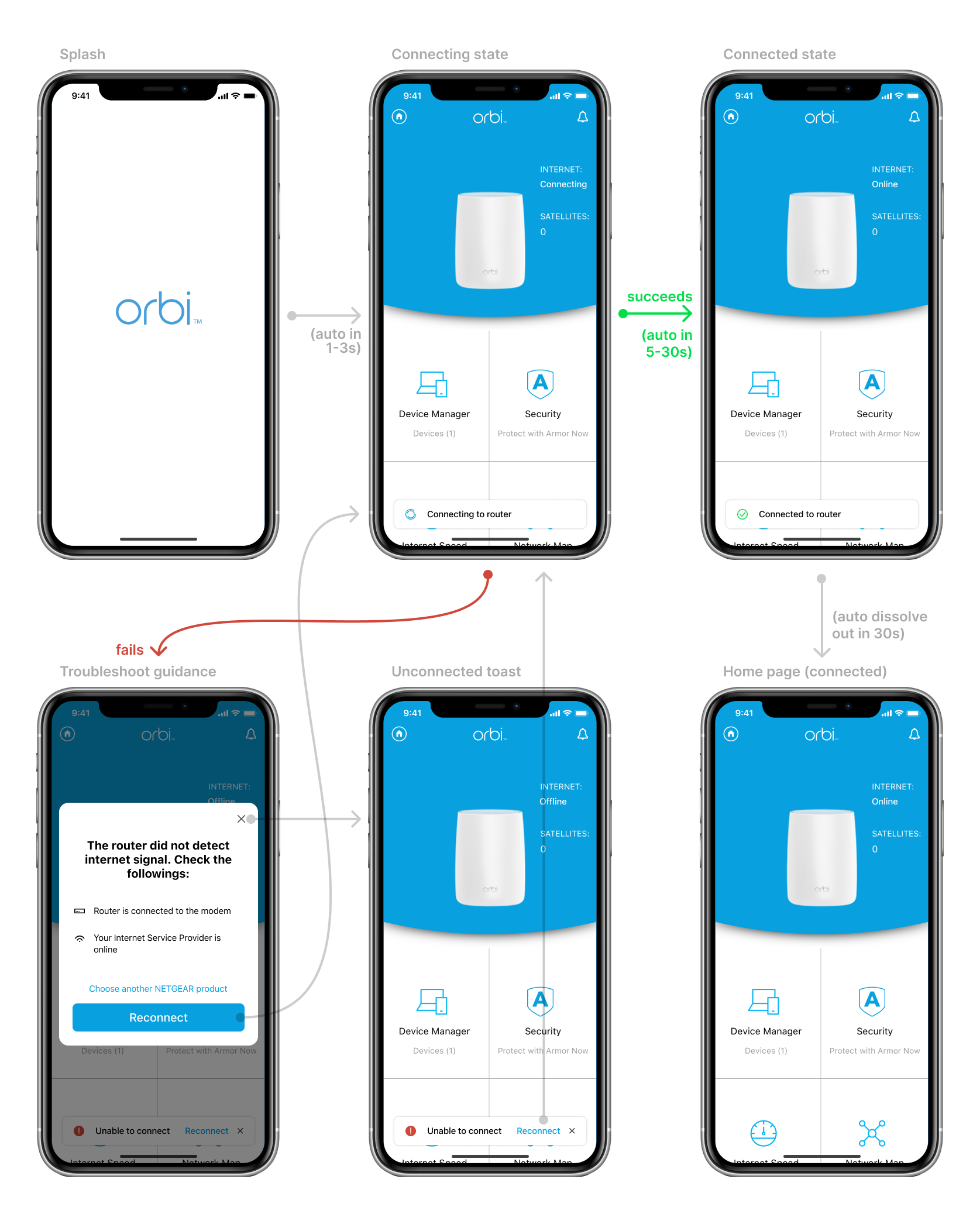
The map below illustrates the current error state experience, which leads to a "dead-end" if users fail to troubleshoot.
Ideal Experience
Covering the pain point above to a user goal, I intend to communicate a proposal where no dead end exists in the error state, enabling users to choose to proceed to troubleshoot now or later, with multiple entry points prompted in different areas in the app and the ability to skip or return.
User Goal
3
Be properly guided with a clear and flexible instruction to troubleshoot
Component Design
Define key design system principles to steer new components toward success.
A successful design deliverable not only meets user satisfaction but also considers the internal development process.
After addressing the communication clarity issues, I analyzed the benefits from both the design and development end with a systematic approach.
I summarized three major principles that benefit the decision-making of the new component design:
Design System Principles
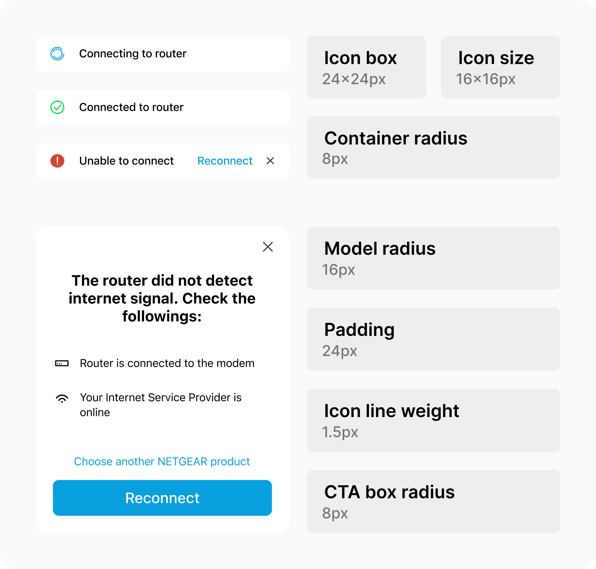
Consistency
An ideal UI component should display consistency in size, placement, and animation for all possible scenarios.
Scalability
Being scalable means the component should consider all possible screen types, sizes, and proportions.
Reusability
Reusing a component can reduce the workload on the development side, as well as enable consistency.
Leading Practice of "8-point Grid"
I pushed forward the design pursuit of visual consistency by keeping key measurements multiples of 8, including padding, element sizing, and radius, ensuring that the rest of the design system components align with industry standards.
Using an "8-point grid" benefits the design consistency with high coherence throughout the experience in the app, and it's responsive-design friendly.
Delivery
A light yet critical experience enhances frequent app users' daily usage satisfaction.
While design significantly influences its development, the project's success relies heavily on the collaborative effort of both the product and engineering team members.
The map below illustrates the overall flow addressed in the loading experience:
Measuring Success
Though measuring success for this project with numerical data is tricky, as it does not directly reflect on any key performance indicators (KPIs), I have summarized a few possible areas where it could be measured through a wider scope:
Fewer customer service calls related to failed connection
More positive reviews about the loading experience
Testimonials
"...I can finally access my security information when I'm not home and not connected to the router. It is no more annoying."
5-star review from App Store
"I appreciate when I cannot connect to the internet and the app tells me exactly what to do."
5-star review from App Store